

Rachel Falco Photography
Rachel wanted something fresh and approachable for her new photography business, Rachel Falco Photography. She needed to appeal to the young couples and families with children. We developed this clean logo with modern colors. I couldn't resist giving her a couple variations of her logo in alternative color combos. They open up the possibilities of each variation being used for a different part of the business: i.e. engagements, newborn, maternity... Oh the possibilities! Have fun with your new look, Rachel! Visit Rachel's website or her Facebook page to see some of her great shots.


Monogram Monday: Marcie and Trevor
Marcie and Trevor wanted a monogram to reflect the clean modern aesthetic planned for their wedding. I like how the M is suggestive of a bow tie, perfect for their black tie affair.

Lauren Somero Photography
Lauren Somero created an awesome inspiration board for her brand. It included natural tones, textures, casual feminine fashion. She wanted something that was simple and would appeal to customers seeking a infant and family photographer with her natural style. After a couple rounds this logo rose from the bunch and spoke to Lauren. I love the texture of the flower icon. I think it subtly reflects Lauren's love for rustic textures while keeping it clean and classy. I also love how we created the elements of her watermarks to vary in opacity. Visit Lauren at her Facebook page.


Printable: March Icons - St. Patrick's Day and Easter
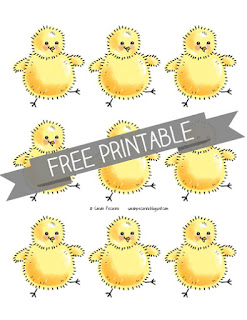
Here are some icons I created for our calendar at home. There is a page of four-leaf clovers and a pot of gold for St. Patrick's Day. For Easter there is a page of assorted eggs and another of one happy chick. Each of the icons is between 2 1/4 and 2 3/4 inch tall. They are perfect for kids play with patterns, to decorate the house, or as adorable cupcake toppers when taped to the end of a toothpick. Let me know how you end up using them! Click on each image to download or download the whole set HERE.


Monogram Monday: Sarah & Julian
I created this monogram for my wedding back in 2008. The client was very particular (ahem, pointing to self) and wanted something with a traditional reference with a unique twist. I combined the use of Copperplate for the S and J, and two different fonts for the P. It was made into a rubber stamp and used on multiple elements throughout the wedding.


Kayla Creamer Photography
I recently worked with Kayla of Kayla Creamer Photography to develop a fresh new logo for her business. I pulled the colors from a collection of images that Kayla had pulled together as inspiration. Her brand colors were right there waiting for us!


Monogram Monday: Ashley & Kevin
This is a classic monogram designed to accompany a classic and sophisticated wedding invitation suite. Ashley and Kevin used this monogram on cardstock to seal a ribbon around their invites. Simple and classy.


I actually used this monogram for a textured monogram painting using spackling paste and a Mod Podge transfer method. It came out pretty cool. I'm still itching to use the technique to create something for my own house.
Monogram Monday: Kristal & Dave
Kristal and Dave wanted a monogram to tie wedding elements together with their invitation. They had it made into a rubber stamp. I'm such a huge fan of stamps. I love that each time you put a stamp to paper the mark is unique.

Donuts, Yum Yum!
Who doesn't love a good donut? Every once in a while I indulge in a good ole Boston Cream or my seasonal favorite, an apple cider donut. When I worked at the theater the other donut eaters would lecture me on donut etiquette when I only ate half at a time. Sometimes I rationalize that if I only eat half at a time then its only half of the calories. This piece is an ode to that delicious half dozen. Special care was made to include a birthday girl's favorite pink frosted number as this piece was made in her honor.


Vintage Distressed Custom Sign Print
Ahhh, love is in the air! I recently created a cool piece for a client to give as a gift to their newly engaged brother and future sister-in-law. They liked a monogram painting I did last year but needed something that could be sent via snail mail to California. Based off of some info about the couple's decor style and wedding theme I designed this 16 x 20 inch piece and had it printed by Ritz Photo onto their Deep Matte paper.
 It was shipped directly to the couple so I didn't get to see it in person, but I'm told they love their new artwork and it works perfectly with their modern rustic decor.

Subscribe to:
Posts (Atom)
If you liked this post you might like these:
